Don’t Let Them Leave at the Finish Line with Checkout Page Optimization
The Hidden Revenue Problem Every E-commerce Store Has

Checkout page optimization is the process of removing friction from your checkout flow so more shoppers complete their purchase instead of leaving at the last step.
Here’s a quick breakdown of the highest-impact fixes:
| Problem | How to Fix It |
|---|---|
| Forced account creation | Add guest checkout as the default option |
| Hidden shipping costs | Show all fees early, before checkout |
| Too many form fields | Reduce to 8-12 essential fields only |
| Limited payment options | Add digital wallets and BNPL |
| Poor mobile experience | Design for touch first, desktop second |
| No trust signals | Display SSL badges near payment fields |
| No progress indicators | Add a step-by-step progress bar |
You built a great product. You drove traffic. You got someone to click “Add to Cart.”
And then they left.
That’s the reality for most online stores. Nearly 70% of shoppers abandon their cart before completing a purchase. That’s not a traffic problem. That’s not a product problem. That’s a checkout problem.
The cost is staggering. In the US and EU alone, poor checkout experiences account for an estimated $260 billion in lost orders every year — and most of that loss is entirely preventable.
Think about it this way: every dollar you spend on ads, SEO, or content is wasted if your checkout sends customers running. Fixing your checkout is the highest-ROI move you can make in e-commerce — higher than most marketing tactics because it converts intent that already exists.
The good news? Most of the fixes are straightforward once you know where to look.
I’m Trav Lubinsky — entrepreneur, investor, and founder of Trav Brand — and after launching and scaling multiple consumer and e-commerce ventures, checkout page optimization is one of the clearest levers I’ve seen move the needle fast. In the sections below, I’ll walk you through exactly what to fix and in what order.
Key terms for checkout page optimization:
Why Checkout Page Optimization is the Highest ROI Lever in E-commerce
When we talk about growing an e-commerce business, the conversation usually starts with “how do we get more traffic?” But if you are losing 70% of online customers at the final hurdle, pouring more traffic into the top of the funnel is like trying to fill a bucket with a massive hole in the bottom.
Checkout page optimization is the highest ROI lever because it targets users who have already done the hard work for you: they’ve found your site, liked your product, and decided they want to buy it. At this stage, their purchase intent is at its peak. Any friction you remove here results in an immediate conversion lift.
Research shows that by simply fixing usability issues in the checkout flow, the average e-commerce store can see a 35% increase in conversion rates. When you consider that US and EU businesses lose roughly $260 billion in lost orders every year due to preventable abandonment, the financial impact of these “small” tweaks becomes massive.
Beyond the immediate revenue recovery, a smooth checkout builds long-term customer loyalty and improves brand perception. If a customer struggles to give you their money, they likely won’t come back. We focus on Ecommerce Conversion Best Practices because the checkout isn’t just a transaction; it’s the final impression of your brand’s reliability.
7 Proven Strategies for Checkout Page Optimization
To win at the finish line, we need to treat the checkout as a psychological journey, not just a set of form fields. The goal is to reduce “cognitive load”—the amount of mental effort a user needs to expend to complete the task.

One of the most debated topics in checkout page optimization is whether to use a one-page or multi-step layout. While there is no “perfect” answer for every brand, here is how they typically stack up:
| Feature | One-Page Checkout | Multi-Step Checkout |
|---|---|---|
| Speed | Faster for returning users | Can feel slower due to page loads |
| Psychology | Shows the “finish line” immediately | Reduces overwhelm by segmenting data |
| Analytics | Harder to track specific drop-off points | Excellent for seeing exactly where users quit |
| Mobile UX | Great for scrolling | Often better for small screens to avoid clutter |
Regardless of the structure you choose, the following seven strategies are non-negotiable for anyone following a Conversion Rate Optimization Ultimate Guide.
1. Why Guest Checkout is Essential for Checkout Page Optimization
If there is one “conversion killer” that reigns supreme, it’s the forced account creation screen. Imagine walking into a physical store, picking up a shirt, walking to the register, and having the clerk say, “Before you pay, please fill out this four-page membership application.” You’d leave.
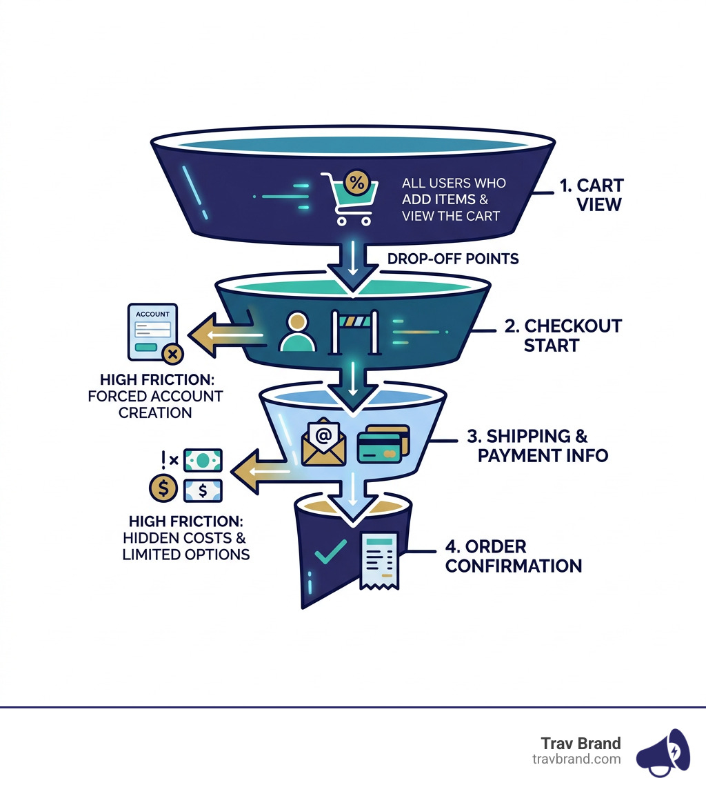
The data backs this up: 26% of customers abandon carts due to forced account creation. Shoppers view registration as a barrier to their goal. They worry about spam, they don’t want to remember another password, and they are simply in a hurry.
In my experience sharing Top 10 Reasons Why People Check Out of Checkout, mandatory registration is always near the top. The fix is simple: make guest checkout the most prominent option. You can still get them to create an account after the purchase is complete on the “Thank You” page. At that point, you already have their email and shipping info; all they need to do is choose a password.
2. Implement Transparent Pricing and Early Shipping Visibility
Surprises are great for birthdays, but they are toxic for Cart pages. There is nothing that kills a sale faster than a customer seeing a $50 total in their cart, only to reach the final payment screen and see it jump to $72 due to “hidden” shipping fees and taxes.
In fact, 46% of shoppers abandon due to unexpected extra costs. To optimize your checkout, you must provide pricing transparency as early as possible.
- Show shipping estimates early: Use a zip code calculator on the product or cart page.
- Highlight free shipping thresholds: Use a progress bar that says, “You’re only $15 away from free shipping!” This doesn’t just reduce abandonment; it actually boosts your average order value (AOV).
- Be specific with delivery promises: “Arrives by Wednesday” converts much better than “3-5 business days.”
3. Streamline Forms with Inline Validation and Smart Defaults
The average checkout contains 14+ form elements, yet most transactions only truly require about seven or eight. Every extra field is another opportunity for a customer to get frustrated and quit.
When we audit a Checkout page, we look for ways to reduce the “work” for the user:
- Address Autocomplete: Integrate tools like Google Maps API so users only have to type the first few letters of their address.
- Smart Defaults: Default the billing address to be the same as the shipping address.
- Inline Validation: Don’t wait until the user hits “Submit” to tell them their phone number is missing a digit. Use real-time “inline” validation to show a green checkmark or a helpful error message as they type.
- Field Reduction: Do you really need “Company Name” or “Address Line 2”? If it’s not essential for delivery, cut it.
4. Leverage Digital Wallets and Diverse Payment Options
We live in the era of the “one-click” buy. If a customer has to get up, find their wallet, and manually type in a 16-digit credit card number on a mobile phone, you are losing money.
Data shows that 40% of shoppers abandon carts when mobile wallets are unavailable. By integrating Apple Pay, Google Pay, or PayPal, you allow users to authenticate with FaceID or a single tap. This bypasses the entire form-filling process.
Additionally, offering “Buy Now, Pay Later” (BNPL) options like Klarna or Afterpay can significantly increase conversions for higher-priced items. Providing payment diversity is a core part of How to Boost Your E-commerce Conversion Rates and Keep Them High.
5. Build Trust with Security Signals and Social Proof
As users move closer to the “Pay” button, their anxiety levels naturally rise. They are asking themselves: Is this site secure? Will my data be stolen? What if the product is junk?
About 25% of consumers abandon due to a lack of trust in payment security. You can combat this by placing “trust signals” exactly where the anxiety occurs—right next to the credit card fields.
- Security Badges: Display SSL certificates and trusted payment icons (Visa, Mastercard, Norton).
- Social Proof: A tiny snippet saying “Joined by 10,000+ happy customers” or a 5-star rating icon can provide the final nudge needed.
- Policy Links: Ensure your Checkout Legal Policy and return policy are easily accessible but don’t take the user away from the page.
6. Use Progress Indicators to Reduce Cognitive Load
Humans are hardwired to want to finish what they start. This is the psychology of task completion. If a checkout process feels like an endless tunnel, users will get tired and leave.
By adding a progress bar at the top of the page, you provide visual guidance and “user certainty.” It tells the shopper: “You are on step 2 of 3.” This makes the process feel manageable and shorter than it actually is. It’s a simple but effective tactic we recommend in our Optimize for Conversions: Complete Guide.
7. Mobile-First Design for Checkout Page Optimization
Mobile commerce is not the future; it is the present. It is set to account for 59% of all e-commerce sales in 2025, yet mobile conversion rates are consistently lower than desktop. Why? Because most checkouts are designed for a mouse and keyboard, not a thumb.
To optimize for mobile:
- Large Touch Targets: Ensure buttons are at least 44×44 pixels so they are easy to tap.
- Correct Keyboards: If a user clicks a “Phone Number” field, the numeric keypad should automatically pop up.
- Page Speed: A 2-second delay in load time can increase abandonment by up to 87%. Mobile users are famously impatient.
- Sticky “Pay” Button: Keep the call-to-action visible even as the user scrolls.
This is often Why Most Shopify Stores Underperform—they use themes that look pretty on a laptop but break down on an iPhone.
Measuring and A/B Testing Your Checkout Performance
You cannot fix what you do not measure. Checkout page optimization is an ongoing process of testing and refining.
Start by looking at your funnel data. Where is the biggest drop-off? If users are leaving the moment they see shipping costs, you have a pricing transparency problem. If they leave on the “Payment” page, you might be missing their preferred payment method.
We use tools like session recordings and heatmaps to see where users get stuck. Sometimes, a simple change like moving the “Discount Code” box so it’s less prominent (to prevent people from leaving to hunt for coupons) can result in a massive win. Learning How to Optimize Conversion Rate requires a data-driven mindset where you test one variable at a time.
Frequently Asked Questions about Checkout Page Optimization
Is a one-page checkout better than a multi-step checkout?
There is no universal winner. One-page checkouts are often faster and reduce the number of clicks, which is great for simple purchases. However, multi-step checkouts can be less overwhelming for complex orders and allow you to capture an email address in step one, enabling you to send abandoned cart recovery emails if they leave later.
How many form fields should a high-converting checkout page have?
The sweet spot is usually between 8 and 12 fields. While the average store uses over 14, research shows that you can usually cut that in half by using address autocomplete, combining “First Name” and “Last Name” into one field, and hiding optional fields like “Company Name.”
Why is guest checkout the most important factor in reducing abandonment?
Because it removes the biggest psychological barrier to entry. Forcing a user to create an account feels like a commitment and a chore. Guest checkout allows the user to maintain their momentum and complete the transaction with minimal friction.
Conclusion
At Trav Brand, we don’t believe in “set it and forget it” e-commerce. We build and scale brands by obsessing over the details that others miss. Checkout page optimization isn’t just a technical task; it’s about respecting your customer’s time and making it as easy as possible for them to get what they want.
If you haven’t done it lately, Go Ahead, Be Your Own Online Customer. Walk through your own checkout on a slow mobile connection. If you feel even a second of frustration, your customers do too—and it’s costing you money.
We focus on measurable results and digital strategies that actually move the needle. Whether it’s streamlining your forms or integrating next-gen payment systems, every tweak to your checkout is a step toward a more profitable, scalable brand.
For more deep dives into e-commerce strategies, stay tuned to our latest guides. Let’s stop leaving money at the finish line.